What Is an Em Dash—and When Should I Use One?
Em dashes, en dashes, and punctuation in the age of AI.
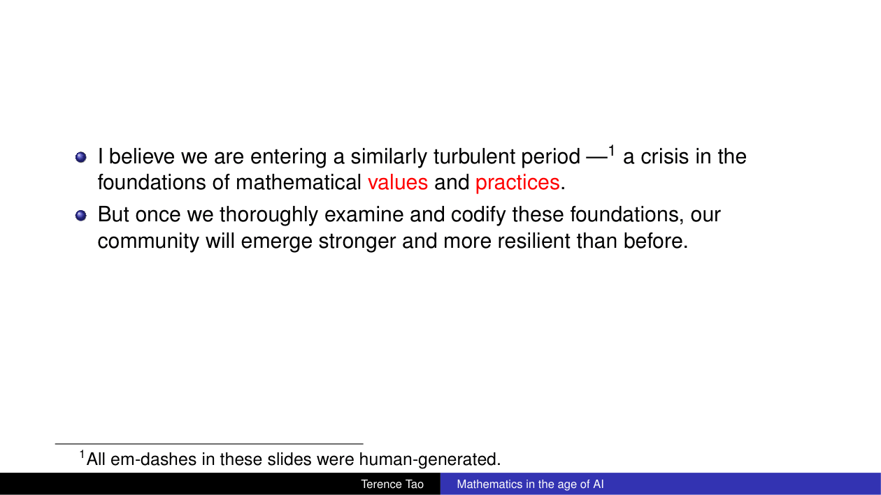
The slide above is from a talk by Terence Tao at ICM 2026, called Mathematics in the Age of AI. I like this slide. I find it a little funny, but it also made me think. It seems like using proper punctuation is now sometimes associated with AI. When I see an em dash, I think to myself “oh, this was probably AI-generated!” I even started to remove em dashes from some of my writing to make it look “more human.”
The thing is, I think I actually started to use em dashes because of AI. I just saw em dashes appear in more and more text, so I kind of just picked up how to use them by example. However, I don’t remember ever learning in school how to use one properly. So I thought I should finally learn.
I know that in I Am Assigning Myself Homework, I said I would explore things outside of topics I am familiar with (for example, I would not necessarily explore things in AI), but I also said that I wanted to just follow my curiosity. So, I guess the first post in the quest to hear the voice of il fanciullino a bit louder will be at least adjacent to AI.
What is an em dash?
Before looking it up, I thought “–” was an em dash, but that’s actually an en dash. Turns out the em dash is a bit longer. The following table shows the difference between some of the most commonly used horizontal marks.
| Symbol | Name | Role |
|---|---|---|
| - | Hyphen | Joining words, as in well-made |
| − | Minus sign | Subtraction: 7 − 4 = 3 |
| – | En dash | Ranges: pages 12–18 |
| — | Em dash | A break or interruption in a sentence |
I also remembered that when you write a paper in LaTeX, you can define spacing in terms of an em. It turns out that an em is a unit of typographic measurement. In modern digital typography, one em corresponds to the current type size, e.g., in 12-point type, one em is 12 points.
Traditionally, however, one em was described as the width of a capital M. An en is (typically) half an em (this sentence is fun to say out loud quickly!). One useful mnemonic is that the letter n only has one bump and the letter m has two, so it’s double the length (note that this is just a mnemonic that I find useful and not a typographic rule).
When should I use one?
An em dash is a break that you want to reader to notice, and can also be a substitute for commas, parentheses, a colon, or a semicolon, with some difference in tone.
Let’s look at some examples. A pair of em dashes can set off an aside that deserves more attention than it would receive inside commas or parentheses:
My favorite punctuation mark—which is apparently suspicious now—is the em dash.
A single em dash can introduce an explanation (substituting a colon) or create a sharp turn:
I had finally learned the rule—then I noticed that different style guides disagree.
It can also mark an interruption or an unfinished thought:
“But I thought the em dash was—”
“That was an en dash.”
The Chicago Manual of Style gives a simple piece of advice: “When in doubt, edit them out.” So, I guess in my quest to make my text look less AI-generated, I have been following the Chicago Manual of Style. I have now learned enough to use em dashes on purpose—which probably means I should use fewer of them.